Indoor climate and well-being
Industry trends
Interior design

Colour Trends in Interior Design: Choose the Right Colour for Your Space

Rockfon Brand & Communication Team
May 22, 2022

Interior décor is moving forward and drawing inspiration from our surroundings. It’s an eclectic mix of colours that evokes the warmth, harmony, balance, and feeling of celebrating life today.

Colours of Wellbeing swatches

Welcoming New Colour Trends into the Interior Design   

When it comes to interior design, one of the most important aspects is choosing the right colour palette. This can be a daunting task, as there are endless possibilities and combinations.  

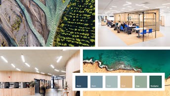
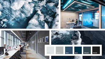
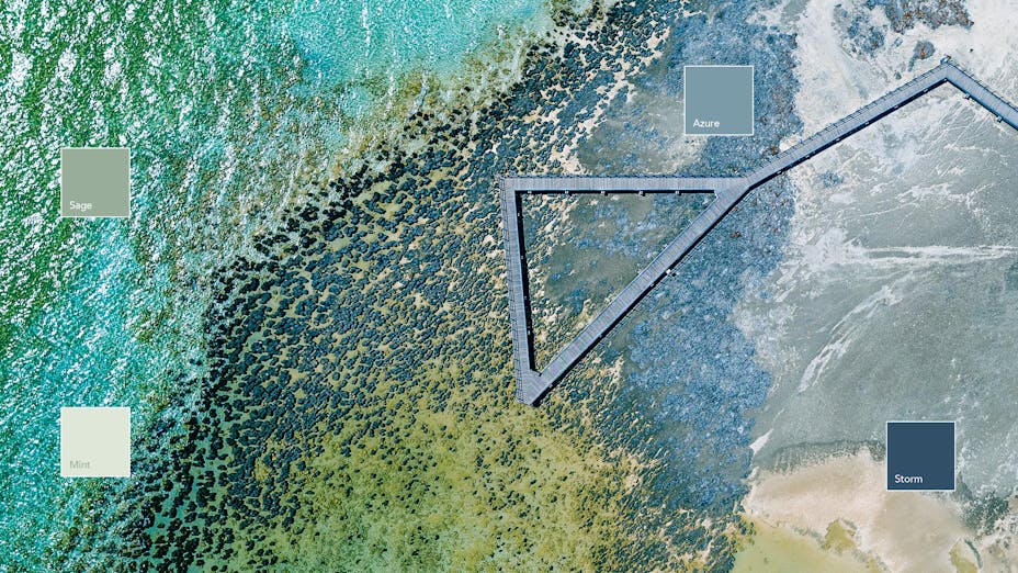
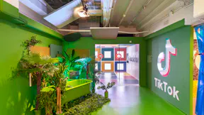
Different colour combinations can create specific moods and atmospheres. They also have a big influence on our emotions and behaviours. For example, the colour red may stimulate people's appetites while blue can create a feeling of calmness. Green is said to promote productivity. 

However, by keeping up with current interior design trends and considering the latest colours, you can narrow down your options and choose a scheme that is perfect for your space.  

One of the latest trends in interior design is biophilic design, which incorporates elements of nature into the home. This can be done in many ways, but one popular method is to use natural materials and colours. Technology is also playing a big role in interior design, with many spaces now incorporating smart technology into their design.   

Despite the urge to use colours, the colour trend Wabi-Sabi honour and promote simplicity and minimalism. This trend often uses neutral colours to embrace tranquillity and celebrate imperfection. And as a response to climate change, Calm Enclosure reflects a retreat into the enveloping interiors with soft textures and a balance between masculinity and femininity.  

In recent years, there has been a shift away from using neutral colours and more towards colourful designs. In this article, we explore the different colour trends and pinpoint what effect the different colours give you and your space. 

Biophilic Awareness – Reconnect with Nature   

How can we make use of nature to improve our lives and at the same time take advantage of the benefits the planet gives us while deepening our understanding of the surroundings?  

Biophilic design is a concept that focuses on increasing occupants' connection to the natural environment using elements from nature. It seeks to connect our inherent need to affiliate with nature in our modern built environment while fostering emotional relations to spaces and places. The emotional link motivates people’s performance and productivity.  

With the foundation in the biophilic design trend, we’ve created a colour trend called Biophilic Awareness that’s expressed by ‘bringing the outside in.’ Introducing natural materials into the home design can help us connect with nature more. This includes using organic materials like stone, wood, and plants, as well as natural light and water. 

The biophilic design trend wins grounds between architects and interior designers where they incorporate more natural elements into the place, we live and work. Biophilic Awareness has the power to bring tranquillity, clarity, and a sense of comfort to our minds.   

Living in the cities prevents us from taking part in nature and enjoying the surroundings, we’re immersed in a world of concrete, cold spaces and urban environments with harsh elements. But what if we could change this setting?   

What colours to use for Biophilic Awareness?   

Biophilic design connects us with nature. If this is your aesthetic, explore our palette of daylight yellows, natural blues and greens.   

Rockfon Color-all swatches for well-being
The Colour: Inspiring Greens   

People surrounded by plants and greenery are likely to be 15 % more creative and have a higher level of well-being. According to research, certain colours can change how people work. For example, if you use a green palette, employees might be up to 6% more productive.  

The green palette is also said to enhance creativity. The reasoning for this is that humans focus better on a green light as it is in the middle of the visible spectrum and has the strongest receptors in our eyes. Want a creative space? Just add green!   

The colour collection of Inspiring Greens covers the colours: Mint, Sage, Eucalyptus, and Seaweed. The colour scheme makes people feel comfortable and relaxed. It also makes them feel connected to nature and the breeze. 

Uncluttered Wabi-Sabi – Welcome Flawed Beauty   

Nowadays, people spend more time indoors. We are more aware of how our surroundings affect our everyday lives. This is why many people are looking for interior design features that will make them feel calm and peaceful. 

We aim to re-examine our values and help us find a state of well-being by finding meaningful aspects in our everyday existence. We take a step back into simplicity and celebrate imperfection. It’s all about returning to basics, learning from history, regaining forgotten skills, restoring natural resources, and welcoming the flawed. 

Wabi-Sabi is a Japanese term that means "flawed beauty." This type of beauty can be found in nature, and it is organic, asymmetrical, imperfect but still aesthetically pleasing. Uncluttered Wabi-Sabi is not purely aesthetic but a celebration of life, recognising, accepting, and embracing all aspects.   

The simple, calm Japanese aesthetic takes a step back from the manufactured perfection of modernity. It uses light and transparent materials — such as silk, smoky glass, and linen — to create a sense of tranquillity. This allows people to appreciate the beauty of imperfection, connect with nature, and enjoy simple pleasures.  

What colours to use for Uncluttered Wabi-Sabi  

Uncluttered Wabi-Sabi uses light and translucent materials to create a layered colour palette. It goes from soft greys to warm beige. The light colours, unfinished interiors and materials are linked to our desire to disconnect and search for “nothing”. 

Rockfon Color-all swatches for well-being
The Colour: Positive Pinks   

According to colour psychology, pink inspires hope and positivity which encourages a sense of comfort and relaxation. The colour pink stands for softness and compassion because it is a mix of the colours red and white. Red is passionate and energetic, while white is pure and innocent. This combination creates a colour that represents tenderness and affection. 

Positive Pinks range over the colours Petal, Seashell, Coral, and Scarlet that are empowering and energising.   

The Colour: Mood-lifting Yellows   

Research figured out that most people associate yellow with happy, cheerful feelings. And when the colour yellow is considered, most people link it to words like sunshine, warmth, cheer, and happiness. In most cases, that’s true.  

However, the geographical position also comes to play when thinking about the colour. The further people live away from the equator, the more they appreciate these bright hues.   

In Egypt, the likelihood of yellow being associated with joy was only 5.7 %. However, for people living in chilly Finland, it was 87.7 %. 

The colours for Mood-lifting Yellow are Stuco, Sand, and Mustard all give a sense of mood-lifting, optimism, and happiness.   

Calm Enclosure - A Relaxed Retreat   

In the light of climate changes, political, and economic uncertainty, we look for a calm, cool, and collected place. A retreat into reassuring and enveloping interiors with relaxed atmospheres and softness can reduce stress and anxiety. 

Neutral shades found in nature have a calming effect. They don't distract the eyes and don't take over the interior. As a result, we developed the colour trend Calm Enclosure to express the gender-free style with nudes, powdery pinks, corals, and scarlet combined with rounded, wavy, shapes. 

What Colours to Use for Calm Enclosure?   

Calm Enclosure creates a calm and soft atmosphere by using bright colours from nature.  Sandy yellow, warm beiges, soft reds and pinks create a soft balance between masculinity and femininity. Acoustics are high on the agenda for creating a comfortable, cosy ambience that soothes and nurtures our well-being.   

Rockfon Color-all swatches for well-being
The colour: Relaxing Browns   

Natural earthy tones and brown is a direct association with our mother earth. It evokes feelings of warmth, comfort, and security. These colours have also been connected to an increase in tryptophan, which is related to sleep and our immune systems, as well as serotonin, which is tied to mood. 

Relaxing Browns have a colour palette of Chalk, Linen, Cork, and Earth.   

Technology – the Unified Intelligent Tomorrow   

The way we think about our own identity, and the way it is connected to artificial and human intelligence, has changed. Virtual reality allows us to escape into worlds that are like our own, but where life is safer, and everything is fiction.   

The colour trend Technology is a statement for a unified intelligent tomorrow. It’s inspired by the merger of human and artificial intelligence to create futuristic yet subtle designs. It expresses itself by juxtaposing regular and irregular forms, hard and soft materials such as stone with smooth suede and mixing gloss and matte surfaces. The colours are pure and clean, chromatic blue, dark blue, and silver. Inspired by the future, and confident for a better tomorrow.  

What colours to use for Technology?  

Rockfon Color-all swatches for well-being
The colour: Calming Blues  

The colour blue is often linked with feelings of calmness or serenity. The colour empowers peacefulness, tranquillity, and security. It’s a strong influence on our well-being and health, where it helps to steady our breathing, lower our blood pressure, and clear our minds when feeling overloaded.    

Calming Blue encompasses the colour schemes of Fresh, Azure, Storm, and Space, which are associated with calmness, restfulness, and concentration. 

The colour: Cool Greys  

The colour grey is a hot neutral shade meaning it’s controlled, inconspicuous, and controlled. The human eye can see 500 shades of grey. This means that it is easy to create depth, focus, rhythm, and vitality in the interior by using different tones, tints, and shades.  

Grey's popularity stems from its adaptability with the ability to convey any desired feeling. It's a popular colour option for designing home interiors, elegant workplace settings, and public locations. 

The Colour Journey  

Colour influences our every waking minute, according to Karen Haller, author and world-renowned specialist in Applied Colors and Design Psychology. However, only 20% of us are aware of why we take certain colour choices or decisions. These decisions are related to both the learned associations and colour associations from nature.   

The key to creating the right atmosphere in a space is by choosing the right colour. Using very dark colours in a small place, without any natural light, could create an overbearing or cramped feeling. 

However, the same colours in a space with a similar dimension that has plentiful lighting would create a real sense of intimacy and cosiness. There is no "one size fits all" rule when designing with colours. There are so many options to choose from. You can have matching colours on the walls and ceilings, or you can choose to mix and match different tones. 

Colour is one of the many ways to bring nature-inspired design into buildings, which we know can help relieve stress and mental fatigue, support focus and encourage overall mental well-being. According to Emily Winer, who leads WELL Certification's Mind concept, effective use of colour can promote a sense of calm, relaxation, and well-being in rooms intended for mindfulness and restoration, as well as lactation rooms for new mothers.